
Your nonprofit organization needs a new website. Expectations are huge, but your budget is tiny. Once again, you’re being asked to turn straw into gold. And you get it — donors want their money going to your life-changing programs, not into bells and whistles for your website. But how can you build a website that serves the mission of your organization when you have limited resources?
Sound familiar?
At Kanopi Studios, we love nonprofit organizations. In fact, most of us are volunteers, activists, and donors for causes as diverse as famine relief in East Africa to programming lessons for underprivileged kids in San Francisco. And we understand the push-back some nonprofits get when it comes to spending money and time building a great website — especially when it comes to user experience (UX) research.
We’re a data-driven web development company. That means we don’t just make websites that look good; they have to work hard — and smart — at the same time. In the nonprofit world, that means your website not only needs to look modern and appealing, but most importantly, it needs to be usable and have captivating content for YOUR users to help you raise money. The distinction here is that your audience is unique and you need to understand them in order to build a website experience with which they will engage. In our many years of experience, the best way to make this happen is by conducting user experience research before doing anything else.
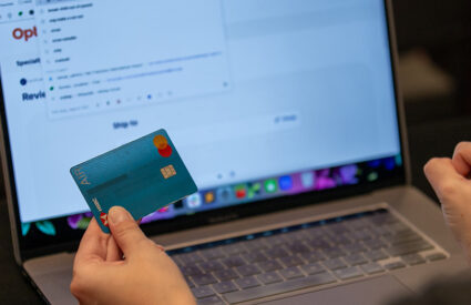
You know the saying, “Do it right or do it twice?” Definitely applies here. In fact, not doing UX research will likely cost you money — maybe a lot of it. If a donor comes to your site with the intention to give, but can’t figure out how to do that or is put off by an awkward or frustrating experience, they won’t be coming back. You’ll have missed out on what could have turned into a lifelong philanthropic partnership. And as boomers and millennials turn more and more toward online and mobile giving, your website is becoming an increasingly vital part of your fundraising strategy. Doing thoughtful but affordable UX research will help you understand what your audience needs. This will inform better usability and help you create compelling content, which will tip potential donors over the threshold into donating funds.
So how to conduct the user experience research you need with the budget you have? For starters, hire a web development company that understands and loves non-profits — like us! We offer great non-profit rates while still providing the same top-quality service we give our corporate clients. We happily work within limited budgets, from UX through to the finished product. We know that improving your website is just one of many projects on your to-do list! Leaning on an experienced firm like Kanopi Studios will all you to focus on changing lives while we do what we’re best at.
Here’s just a sample of how we can bring affordable UX research to your organization:
Create an online site survey. We start with your current users and ask them what’s working and what isn’t (and we’re experts in asking the right questions to get the data we need). We keep the survey short and sweet to make sure it’s not daunting to your audience.
Conduct online user session research. We use an analytics platform to see how current uses are navigating around your site, learning from their behavior.
Use online analytical tools. Google Analytics and other online tools are useful (and free) ways to get an idea of how users are currently interacting with your site. In fact, many organizations (maybe yours?) already have Google Analytics but aren’t using it to its full potential.
Keyword analysis. Keeping with the Google theme, Google’s free keyword planner can help you determine which key phrases will resonate with your audience and direct them toward the action you’d like them to take.
Do a comparative analytics review. We not only analyze your site, but sites similar to yours — especially those that are working well.
Recruit friends and family. Research participants don’t have to be strangers, and they don’t have to get paid. Reach out to your volunteers, staff, donors, and board members (and ask them to reach out to their friends and families!) to create a pool of research participants. Try to find people who fit into your target audience, and remember: not every opinion will apply to your needs. The idea here is to identify general trends.
Go where your audience is. Do you organize a big fundraising event like a gala or a run? This is the perfect place to ask a few questions of your target audience, most of whom will be thrilled to offer feedback. And it costs you nothing. Focus on asking specific questions versus just asking for them to provide their opinions on the site. For example, ask, “What type of information are you looking for when you consider donating to an organization?” Asking questions like these can help inform your content strategy.
Use the back of the napkin strategy. In Rocket Surgery Made Easy, Steve Krug suggests sketching out your web design and flow on the back of a napkin or a scrap piece of paper, and ask test subjects to tell you how they would navigate that site. Nothing fancy, but it gives you the results you need. It’s also easy and quick to modify in this format, so you can iterate as you go.
Card sorting. If we’re going old school with napkins, we can’t forget the UX power of card sorting! Use index cards or sticky notes to map out your site–one card for each page or section. Then ask someone in your target audience to sort the cards according to how they would group the information together. The results can be enlightening! (And it’s also kind of fun.)
Sometimes simple changes translate into big results — but you won’t know what changes to make without research. One of our nonprofit clients was struggling with converting website visitors to donors. Our research showed that the problem was the color of the “Donate” button. Seriously. We changed the color and donations increased.
For another client, the confusion lay in how to log into their personalized account page. Through a series of tests, we determined that a simple language change on the homepage would bring more clarity to site visitors and direct them to where they wanted to go. It worked.
We know that as a nonprofit, you have to do more than less. And we’re committed to helping you with affordable ux as well as other effective ways to spread your message and raise money for your cause. Contact us today and let’s talk about how we can create the very best website for your organization.